
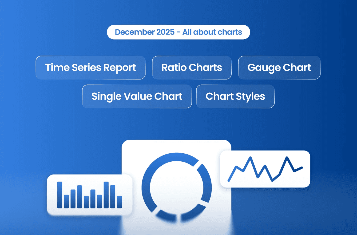
Powerful Charts & Widgets
Powerful Charts & Widgets
Measure, Compare, Improve with New Visual Tools
We’re excited to share our December update, packed with powerful new charting tools and dashboard enhancements designed to help you track performance, spot trends, and make faster, smarter decisions.
Here’s what’s new 👇
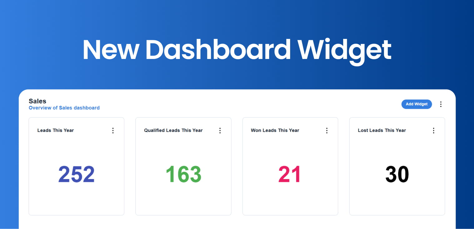
Measure KPIs in a glance
The new Single Value widget displays the total number of records from a saved report—no tables required.
Perfect for tracking KPIs such as:
Leads per month
Viewings
Sales performance
Click any number to drill down into the full report for deeper insights.
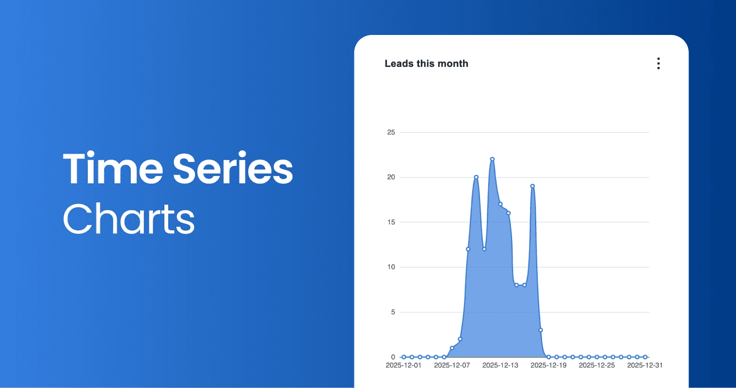
Introducing Time Series Charts
Visualize data over time with our new Time Series charts,
You can now:
Chart any saved search over time
Automatically fill gaps in missing dates
Group and count using any date or datetime field
It’s the easiest way to spot trends and patterns as they happen.
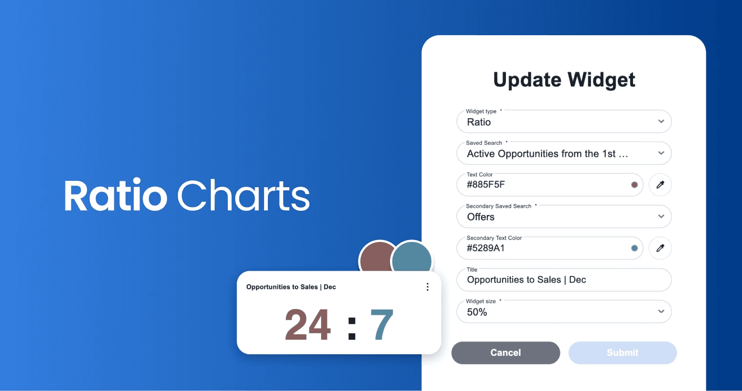
Unlock key insights with Ratio Charts
Compare two saved searches side by side—clearly and visually.
For example:
Leads in negotiation vs leads closed this month
Customize titles and colours, and click either number to view the detailed drill-down report behind it.
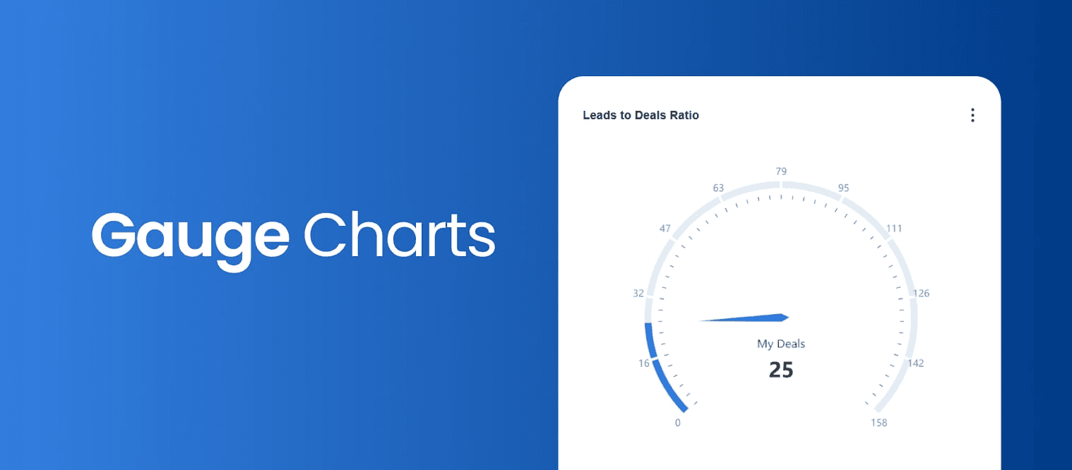
Track performance against targets
Our new Gauge Chart with the striking single-value is ideal for:
Comparing agent performance to goals
Measuring sales vs leads generated
A fast, visual way to understand progress at a glance.
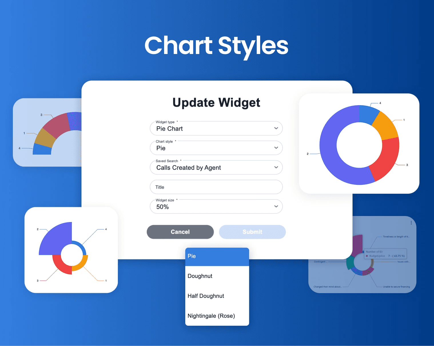
Get creative with Chart Styles
You now have full creative control over Line and Bar charts.
Choose from multiple chart styles to present your data exactly the way you want, clear, compelling, and on-brand.
Back to Release Notes
Powerful Charts & Widgets
Powerful Charts & Widgets
Measure, Compare, Improve with New Visual Tools
We’re excited to share our December update, packed with powerful new charting tools and dashboard enhancements designed to help you track performance, spot trends, and make faster, smarter decisions.
Here’s what’s new 👇
Measure KPIs in a glance
The new Single Value widget displays the total number of records from a saved report—no tables required.
Perfect for tracking KPIs such as:
Leads per month
Viewings
Sales performance
Click any number to drill down into the full report for deeper insights.
Introducing Time Series Charts
Visualize data over time with our new Time Series charts,
You can now:
Chart any saved search over time
Automatically fill gaps in missing dates
Group and count using any date or datetime field
It’s the easiest way to spot trends and patterns as they happen.
Unlock key insights with Ratio Charts
Compare two saved searches side by side—clearly and visually.
For example:
Leads in negotiation vs leads closed this month
Customize titles and colours, and click either number to view the detailed drill-down report behind it.
Track performance against targets
Our new Gauge Chart with the striking single-value is ideal for:
Comparing agent performance to goals
Measuring sales vs leads generated
A fast, visual way to understand progress at a glance.
Get creative with Chart Styles
You now have full creative control over Line and Bar charts.
Choose from multiple chart styles to present your data exactly the way you want, clear, compelling, and on-brand.
Back to Release Notes
Ready to run your real estate business with more clarity and control?
We help real estate teams replace disconnected tools with one connected system for managing properties, leads, websites, portals, automations, and reporting.
Ready to run your real estate business with more clarity and control?
We help real estate teams replace disconnected tools with one connected system for managing properties, leads, websites, portals, automations, and reporting.